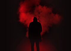
Red is the colour that we have the strongest psychological reaction to. Due to it having a long wavelength, it is the second most visible colour, making it actively noticeable. It has connotations of danger, due to people’s inherited instinctual fear of blood and behavioural characteristics learnt in everyday life. Red has religious connotations of evil due to its associations with the devil and hell. Furthermore, natural uses of red such as it being the colour of fire and poisonous animals associate the colour with danger, this concept is used for conveying important information such as stop signs and traffic lights in modern day.
‘2001: A Space Odyssey’ is a science fiction film directed by Stanley Kubrick, a director known for his bold and dominant use of colour. Red is a common colour in Kubrick’s work, and this film is no different. It is often seen in scenes where danger is imminent, acting as a warning to the audience and appearing at moments of emotional intensity. Many of the scenes are lit entirely in vibrant red light, enveloping everything, creating potent monochromatic images, and foreshadowing the danger characters are in. The film uses the colour red’s connotations to make the audience feel overwhelmed, and to help the viewers connect to the characters. Lighting on the spacecraft is often tungsten-blue which is contrasted by warm oranges to create depth and visual interest, becoming a common colour combination while still communicating a futuristic environment. It also makes the reds more explosive and noticeable by creating contrast and discordance. This film had a huge cultural impact at the time of release, due to it exploring concerns about the rate of technology development with the independent thinking of robots still being a leading fear in modern day, causing its impact to stand the test of time.
Like many colours, red has multiple meanings depending on the setting and context of its use, but culture and personal experience determine people’s reactions to certain colours. Red is seen as the colour of courage in the USA and Eastern Europe, while Japan views this as yellow and Hinduism as orange. This drives films to make their own motifs which are universally understandable for global cinema instead of relying on pre-determined notions which do not translate from culture to culture.
One film that executes this well is Martin Scorsese’s ‘Taxi Driver’. Taxi driver depicts the life of a Vietnam War veteran as he tries to find his way in society, ultimately illustrating his spiral into insanity. The film is a blend of neo-noir and realism, portraying the illusion of reality while still creating the tension associated with the French style ‘dark film’; characterised by harsh shadows and stark lighting effects. The colour red is important as it implies danger as well as immoral behaviour and is a dominant colour throughout the film. It appears at turning points through props as well as costume and set design, highlighting its meaning and creating a motif. Streetlights and signs reinforce this with their bright colour illuminating characters’ faces, while bokeh lights separate close-up character shots from the bustling city backdrop, to remind the audience how easy it is to get lost or forgotten in large cities, just like the protagonist. Tungsten green seen through harsh artificial lights contrasts this and creates the feeling of isolation. Muddy greens are seen through the clothes worn and the colours of the main character’s apartment, reminding the audience of his military background. This could cause the audience to sympathise with the character as it was the effects of war that have driven him to commit these actions, although it could also be seen as a reminder of the character’s history of violence, creating suspense by reinforcing his capability to cause harm. Red and green are complementary colours; offering the most contrast due to them being placed at opposite sides of the colour wheel so drawing the most attention. Despite the usually saturated colours of lights in the city, during violent outbursts, the colours are muted. This was done to avoid the film getting an 18 rating in cinemas, although it could be argued that it is an artistic decision to build tension by exercising colour restraint to create mystery.
‘We need to talk about Kevin’ 2011 is another film which adopts the colour’s cultural connotations to create tension. For example, red frequently appears in the film, mirroring the violent urges that characters feel despite the lack of actual brutality on screen, instilling fear into the minds of the viewers. Blue is also seen everywhere, although it is less obvious, and acts as a calming colour to counteract the explosive reds, making them appear more powerful, showing how all-consuming urges can be. Blue, yellow and red are the most dominant colours in the film, creating a triadic colour scheme where the juxtaposition between the colours mirrors conflict between the characters themselves. This creates discordance to disrupt the colour scheme drawing audiences’ eyes to key focal points.
‘Her’ 2013 is an American science fiction and romance film, directed by Spike Jonze which follows the life of the character Theodore as he finds love in Artificial Intelligence. Due to the cultural connotations of the colour red, it becomes a very important colour for communicating the mental state of the character. The colour surrounds him, seen in his office and apartment showing his all-consuming desire for love, with some scenes being muted and dark, demonstrating the extent of the character’s despair at moments throughout the film. Bright reds and pinks create an analogous colour scheme due to their proximity on the colour wheel.To contrast this, blue is worn by several characters to show their sadness or discomfort, which often contrasts Theodore’s hopeful appearance as he is usually shown in vibrant colours. Furthermore, yellow represents the character’s confusion as he is depicted wearing a yellow shirt in moments of chaos, such as him exploring his feelings. Red may not only represent the character’s desire for love, but also take on a new meaning of anger or frustration, a concept which develops through the film.
Overall, red is a hugely important colour in global cinema, allowing films to nonverbally communicate ideas and emotions to the audience. However, this is only relevant when red is depicted alongside contrasting colours, placing more emphasis on it to give it the greatest meaning.
By Isabelle
BFI Film Academy
Good job🟡👕